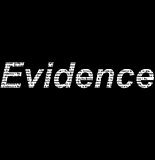
THis was our first idea for the title graphic. A Evidence is often stored in documents the masked words that are used to fill the letters realte back to this idea. What's more, the blurred font connotes that not everything is what it seems.
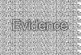
However, after thinking on how to improve this, we developed this idea.
Final Title Graphic

This graphic connotes a lot more to the audience and is far more conventional to the thriller genre.
- The repeated words represent the mind of our killer. It is repetitvie and obsessive which is often conventional for the genre
- The evidence acts as a hightlight on some of the words. Also, it is not very visable which makes the audience look for it; hinting some of the unexpected events in the plot.
- The font is still slightly blurred, acted as a connotation for not everything being as it seems.
No comments:
Post a Comment